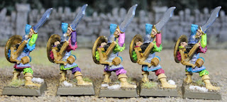
The Company of the Gilded Skull
20 Dark Elf Warriors with hand weapons and shields.
Despite my expectations that January would lend itself to painting, I was sweating this one right to the end. While keeping the Slaneeshi theme, I've gone with darker colors to help set the Company apart from the crossbowmen. I set out to make sure that no two models are alike in this unit, (suitably chaotic) so matching sculpts have different shields, and different color applications. I used a relatively limited palette and the gold shields and skull shoulder armor to tie the unit together. I was really struggling to come up with an idea for the banner for the unit, and sort of dreading free handing something, when I hit upon the notion that Khorne isn't the only one out there who collects skulls, and it fell together after that.
Close ups of the models follow. With the dynamic poses and slightly larger marauder models, this unit is tricky to rank up.
And as requested a group shot of the army as it stands so far.
A few of the models in the army were painted prior to the challenge, so while the "on the table" points value for the army currently stands at 996, I'm only up to 830 points for the challenge


Again, really weird but amazing color choice, bravo! I like the unit’s banner, it is really efrective
ReplyDelete*effective
DeleteI've been pushing myself out of my comfort zone with the colors for the dark elves. If it makes me twich a little, I figure I'm on the right (chaotic) track. Glad you like them.
DeleteThat standard is fantastic. Nice work on the unit and the army.
ReplyDeleteThanks!
DeleteAwesome! So colourful and love the standard. Top job. cheers
ReplyDeleteLovely bright colour scheme. slaanesh would be proud!
ReplyDeleteVery striking color combinations!
ReplyDeleteAs someone who is also working on larger units, I feel your pain. Well done getting them done on time
ReplyDeleteI'm going to steal the banner idea. Nice paintjob!
ReplyDeleteI would never paint that, I suck at color choices, but that is really cool.
ReplyDeleteVery nice. You went a totally different direction with yours compared to my DE's.
ReplyDeleteTbanks everyone! I'm thinking the next unit will be a bit darker.
ReplyDeleteLooking really good Jeff. I like the chains on the banner pole, inspired choice.
ReplyDeleteSick! In a good way!
ReplyDelete